top of page
Lumina is a brand of fictitious skincare products designed specifically for the Gen Z market. This project was born from a fascination with how Gen Z express their visual identity through the use of bright, saturated colors on packaging. As a departure from my usual work on corporate illustrations, I also challenged myself to experiment with typography, excluding any illustrations.
lumina.
Task: Brand Identity, packaging design, logo


Lumina means 'brilliant light'. The concept of lightness symbolizes both the gentle texture of Lumina's skincare product and the delight that customers experience upon achieving radiant skin.

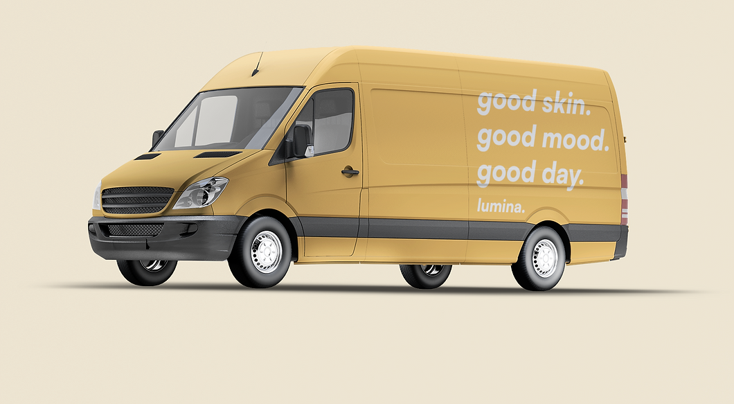
Bold, colourful tones create an overall look of playfulness, fun and align with visual trends that target gen z and millennial audiences

In order to uphold the brand's commitment to skincare science rather than mere surface beauty, I deliberately selected a clean, straightforward typeface along with a simple slogan and minimalist packaging design.
Lumina is dedicated to offering consumers the experience of a soothing spa treatment in the convenience of their own homes, recognizing skincare as an essential act of self-care.


Lumina's visual identity was also explored on other items such as business cards, tote bags and gift packaging.

Tote bag design
_pn.png)
.png)
Social media posts
.png)

Delivery box design


![biz card [Recovered]l.png](https://static.wixstatic.com/media/62b18a_e961004e1d3c4135aabeae8030d43357~mv2.png/v1/crop/x_54,y_183,w_878,h_741/fill/w_853,h_720,al_c,q_90,usm_0.66_1.00_0.01,enc_avif,quality_auto/biz%20card%20%5BRecovered%5Dl.png)
Business cards
.png)
bottom of page