
Priory Live Music Festival
Led the visual rebrand and social media direction for Priory Live Festival, transforming an inconsistent identity into a cohesive, audience-aligned brand.
Creative Direction
Social Media Design
Brand Identity
The Challenge
The brand lacked a consistent visual identity, resulting in weak recognition and limited engagement across social platforms.
The goal was to establish a distinctive and scalable visual system aligned with the festival’s audience and positioning within the indie music scene.
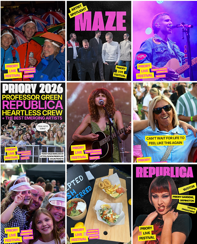
Visual Direction: Before & After
Refined the visual direction to better reflect the culture surrounding independent music:
-
Shifted towards a darker, more authentic aesthetic inspired by grassroots gig posters and London pub venues
-
Introduced a balance between editorial structure and raw, indie energy
-
Developed updated brand guidelines, including colour palette, typography, and photography direction
-
Ensured consistency across all social assets to strengthen brand recognition
After
Before

.png)
Execution
-
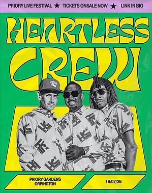
Designed and rolled out social media assets for lineup announcements, artist features, and promotional campaigns
-
Established a scalable content system to support consistent postin
-
Led the implementation of the updated visual identity across Instagram
-
Collaborated with Skiddle to guide the ongoing website redesign, ensuring alignment with the new brand direction
.png)

Artist announcement posters
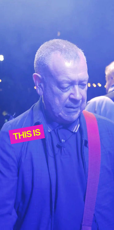


Promotional videos
Results (last 30 days)
-
+80.6% increase in Instagram reach
-
+40% increase in profile activity
-
+50 new followers following visual direction refinement
Improved engagement and stronger audience alignment
Process & Evolution
Introduced an initial bold, colourful direction to establish consistency and visibility.
Following performance insights and audience response, I refined the identity into a more culturally aligned, indie-led aesthetic — improving both engagement and brand positioning.

Before


After
Key takeaway
This project demonstrates the importance of aligning creative direction with audience and context.
By combining visual design with performance insight, the rebrand evolved into a more effective and culturally relevant identity - strengthening both engagement and brand positioning.